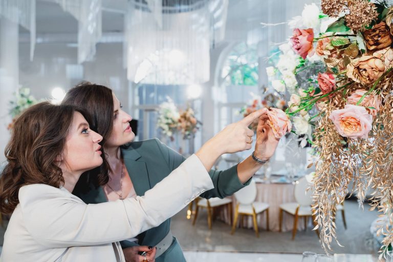
To create this magical atmosphere, the secret lies in color harmony in wedding flowers. The colors you choose will set the tone for your entire event, from the decorations and table settings to the bridesmaid dresses and invitation design. To ensure a beautiful and cohesive look, here are some essential tips to consider:
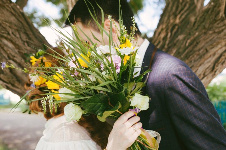
Although they aren’t the most showy element, I think that the colors are one of the most important pieces to a wedding floral design. The colors will evoke the first feeling that guests will get about the wedding. They will help people remember the wedding, and will influence the overall atmosphere and ambiance. A cohesive color palette helps to create flow between all of the wedding flowers and makes it easy to look at all the different bouquets and centerpieces and arrangements. The most successful palettes begin with a dominant hue—perhaps the soft blush of garden roses or the deep navy of delphinium—then build supporting tones. A lot of times there will be one major color and then secondary colors that enhance the major color.
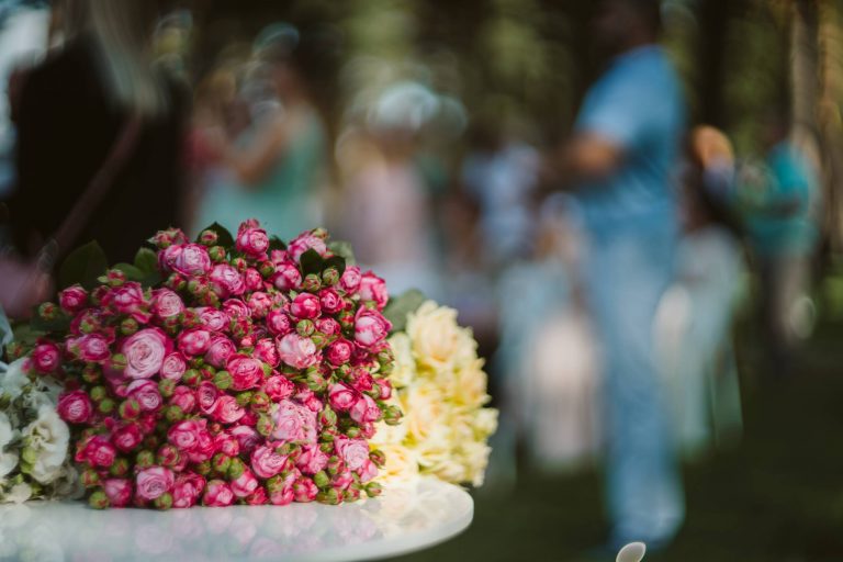
Knowing the emotional meanings of colors makes combinations all the more meaningful. Pastel colors give a romantic and ethereal effect, ideal for daytime and expressing love and sweetness. Jewel tones evoke glamour, sensuality, and opulence and are ideal for night time, especially when combined with candelabras. Whites, ivories, peaches, and pale greens are all calming colors that will not compete with the rest of the decor and can give the eyes a rest. Many times the colors and flowers are chosen based on the dress and decor of the church or reception, or even significant colors in the couples’ relationship, like the color of the dress she wore on their first date, or the color of the groom’s mother blue topaz ring.
Colors are another key factor to consider when creating a beautiful arrangement of flowers. Whether your wedding is in the bright sunlight or the dark evening light, these colors are affected. Many flowers are more vibrant and bright in the daytime, while red and orange tones are rich in the warm evening light. Soft colors are faded by the sunlight and blues and purples get lost in the evening light. Most florists check the color samples of the flowers under the conditions of the wedding to get an idea of the effect of the light. The color of flowers and the texture of the flowers go hand in hand. A more soft, matte colored bloom does not shine with light, whereas the glossy blooms do.
These pairings are also dictated by what’s in season, which helps you choose flowers that are currently growing, rather than having flowers that don’t match shipped in. Pastel shades of green and pink in the spring; bright shades of yellow and magenta in the summer that you have to be careful not to combine in a way that’s too much; deep shades of orange and plum in the fall; and icy shades of white and green in the winter. Using flowers that are in season is often the safest way to go—those color combinations always feel the most organic. Sometimes, it means brides and grooms ending up with a color they didn’t know they loved, like dusty mauve ranunculuses with sage green leaves.
Ultimately, the secret to colour harmony in wedding flowers is not just about crafting beautiful arrangements but also about paying attention to how colour makes us feel. Noticing the way light plays on the petals, the way feelings alter as colour tempos shift, and the way the smallest tweak can take something pretty and make it sing. Used thoughtfully, colour has the power to be the unseen connection between all things visual that we see and experience. Colour can heighten feelings of joy, warmth and festivity. In this subtle way, wedding flowers have the potential to endure long after the day is over in the form of a lifelong impression of colours that will forever remind us of the way that love feels.